
Internal Engineering Tools
I designed and directed implementation of a dual mode interface for a mechanical laser system. Through multiple design iterations and user testing, my solutions improved usability and workflow clarity by 40%.
Role
Lead Designer, Engineer
Duration
3 Months
Tools
Figma, Siemens NX, Visual Studio Code
Team
1 Eng, 1 PM
Problem
The current laser control system was not intuitive, frustrating technicians and engineers, and causing overall process delays.
Solution
An updated and intuitive interface that shows mechanical changes in real time and contains workflows for technicians and engineers.
Intuitive systems, accelerated innovation.

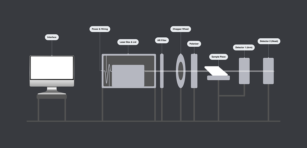
Mechanical Background
To design this interface, I began by understanding the mechanical setup. The machine operates left to right, starting with a laser beam passing from the laser box through different components to measure the sample and send data to two detectors.
Previous Design
I then conducted an audit of the previous design and spoke with technicians and engineers who use the interface. While I cannot share the previous design due to confidentiality, I have synthesized user frustrations and paint points below.
1. Unclear Hierarchy
While there is a training required to operate this system, unfamiliar users were unsure where to begin with the 10+ CTA's on the start screen.
2. Outdated UI
Many elements on different pages appeared clickable and while this is an internal tool, it was very inconsistent with Keysight's design system.
3. Confusing 3D Connection
Setup and system checks were spread out amongst various pages and there was no clear visuals to displaying mechanical changes.

Content blurred for confidentiality.
Ideation
Then, I created an ideal user flow informed by the mechanical system, my previous design audit, and user input before diving into visuals. I narrowed in on a main screen for basic technician use and a manual screen for complex engineering purposes.

Iterations
After several greyscale iterations, I sought feedback on my designs for the main and manual screens from users, designers, and engineers.


Key Change #1
I created a hover menu bar that displays Main mode (for pre-set measurements), Manual mode (for manual engineering measurements), and Diagnostics.

Iteration
My initial design included the main CTA "Start Measurement" button, Main and Manual mode with text descriptions, and Diagnostics to the side. User feedback noted the "Start Measurement" button overwhelmed the menu bar.

Final Design
I simplified the menu to include main pages with tooltips, and moved the CTA for better information hierarchy.
Key Change #2
I designed large graphics for main system elements in Manual mode to make the information more accessible and give them more visual hierarchy.

Iteration
One design concisely displayed system information for a quick setup, but users indicated this blended with the page.

Final Design
I took inspiration from odometers and speedometers to create visuals of the system information. These designs made system setup quicker and more intuitive for users.
Key Change #3
I made over 40 iterations of the Baseline ie. initial system calibration measurement to emphasize the start button while displaying timer visuals for intuitive ease of use.

Iteration
Above are some Baseline designs that best show my explorations. Users highlighted that calibration and re-calibration were the most critical functions, while the timer and visual countdown were secondary.

Final Design
Start and re-start are emphasized as primary, while the circle and timer countdowns are secondary.
Final Design

